Evolving from implicit intent to explicit design rules. Part 2
It's time to come to terms with what we're doing when we design websites, native and web apps, why it's important, and where the future of our design environments is headed.
This is the 2nd part of a two-part series.
In part 1 we explored various scenarios for explicit rules involving width and height, different units of measurement, gaps, distributions, and many others, examining what's available in various tools.
In part 2 I’ll cover more examples of how different design tools tackle different situations of expressing implicit intent with explicit rules.
Let’s dive in.
Layout, order and position
As we discussed in part 1, adopting a rule-based approach might not be the default for designers, but it proves to be the most scalable.
Let's contextualize this within layout decisions, particularly when some objects are contained within another object. In this scenario, two sets of rules are relevant:
Rules that dictate how the parent object should order and position it’s children
Rules that specify how each child element should relate or override the parent-imposed rules
I’ll be providing a number of examples below that put these rules into practice.
Example 1: Wrapping cards inside containers
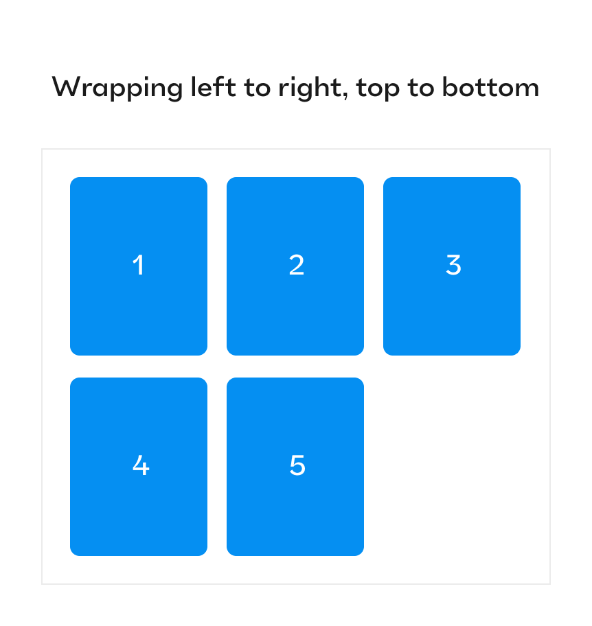
Let’s say that you want to lay out five different cards from left to right, from top to bottom, where only three cards fit the container in its current width:
There are a couple of ways to go about it, depending on the design tool. In Figma, the best way would be by assigning auto-layout to the parent frame and setting it to wrap, aligned top left. In Jux as in CSS, you would use Flexbox on the parent frame, activating wrap, selecting start in the align, and start in the justify options.
Lastly, as a refresher from part 1, the implicit intent in this case would be: “Regardless of the width of the parent container, keep laying more items until there’s no more space to place another one, then move to the next row and continue from left to right”.
Example 2: Changing card position while maintaining layout
Now, consider the following intent: “Upon hover, each card ‘jumps up’ 20px without disturbing any other card.” In vector tools, there’s no way to express the concept of changing something’s position without affecting the layout. This is only possible if there’s a positioning mechanism like in CSS that allows for position: relative on the hover state of the card, while still reserving the space occupied by the card. Code-based tools like Jux, Webflow can support this, but strangely, Framer does not.
Interestingly, Figma supports another positioning option, which is absolute, even within auto-layouted frames. This feature is particularly useful when you want to position an object (like a notification) on the top-right corner of an expandable button and the object will always be pinned in the same place. Moreover, in standard, non auto-layouted frames, all constraints are variations of position: absolute even without explicit selection.
In code-based tools like Framer, Webflow, and Jux, you can simply select the type of positioning to be absolute, regardless of the layout decision. However, in Webflow and Jux this is not the default setting.
Below, you can see how the initial desired intent aligns with the explicit rule in Framer:
Example 3: Child item independence
What if you want most of the items inside a container to stretch, while one item aligns center? For example, when laying out a narrow container with a title and several paragraphs, you may want the title to be center-aligned, but the paragraphs, due to their multiple rows of text, should align left while filling the width of the container.
The implicit rule could be summarized as follows: “Make all these items stretch but this item align to the center, regardless of the parent’s width and the number of items I add”.
Below, you can see the explicit rule mechanics in Webflow:
For this use case, Webflow is the easiest tool. This is because you can use the ‘Flex child’ module to override the general alignment that was set by the parent container— so you don’t need empty containers, just the title and paragraphs in one parent container.
Meanwhile, in Figma, it's more complicated because you can't override the auto layout's alignment setting for a specific child element. Therefore, you'd need to create another frame to contain the title and set it to center alignment.
Example 4: Stacking order
Let’s imagine you’re designing an avatar group widget, where the avatars overlap each other. Your design intent is as follows: “When hovering over any avatar, it should appear above all others, regardless of its position in the idle state”.
To achieve this effect, we need to use a concept called z-index. However, in Figma, doing this would mean giving up the auto layout of the avatars' container. Figma's auto layout allows you to specify whether elements are arranged first on top or last on top, but this feature is primarily geared towards establishing the initial stacking order. It doesn't provide the flexibility to dynamically adjust the z-index of individual elements. The good news is that in CSS and code-like tools, you can specify that in hover state, the z-index will change. This means that in the idle state, the avatars maintain their default z-index order based on the flexbox layout, but upon hovering, the z-index of the hovered avatar is increased, causing it to be above all other avatars.
Example 5: Padding and margin
The position of children elements inside a juxparent container is also influenced by two important properties of the box model: padding and margin.
Padding: A top-left padding of 10px will push any child element 10 pixels from the left and the top sides of the parent container, even if the alignment is to the left. You can think of padding as a short explicit variation to the implicit intent of: “Make sure nothing comes closer than 10px from the left and top sides, regardless of its size or any other rule it has.”
In Figma, padding only exists for frames with auto-layout turned on; ordinary frames don’t have this ability. In CSS, however, padding can be applied in all cases and situations, regardless of the display type. It is worth noting though, that when the child element has ‘position: absolute’ it completely ignores padding. Similarly, when it has ‘position: relative’, its visual placement ignores padding (although its original placement does respect the padding).
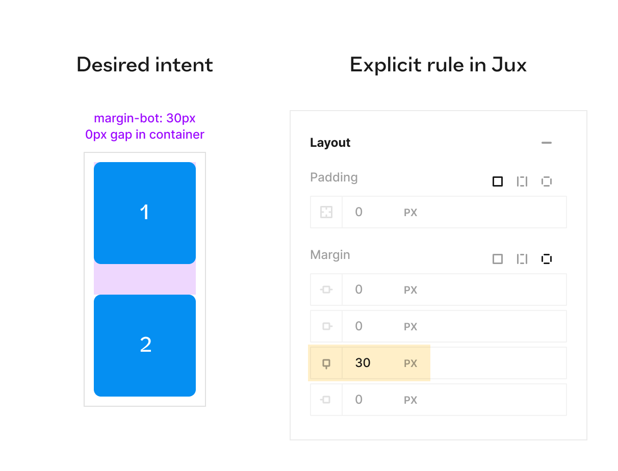
Margins: Margins are also useful for defining ‘safe’ space on each side of an object or creating space between objects, especially when the spacing is irregular (and using the gap feature in auto-layout / flexbox is not enough). Now, it’s important to note that neither Figma nor any other vector tool out there supports margins. So, the only way to ‘fake a margin’ is to wrap an element with a frame and set the frame’s padding equal to desired margin distance. But this is problematic because it leads to unnecessary bloat of frames that are only present due to the inability to use margins. In Jux (and of course CSS), margins are freely available for use in all directions and cases.
So basically, when you create a 30px margin from the bottom of a component, your implicit intent would be: “No matter what, always act as if you take up 30px more space on the bottom”. This ensures that all instances of that component (or class in CSS) will respect the explicit rule, for any other objects they’ll encounter throughout the design.
There is a quirk worth mentioning with margins known as ‘margin collapse’. This occurs when two block-level elements (like a div) have margins. For example, say the top one has a margin-bot: 30px and the bottom has margin-top: 50px, the resulting space between the elements will be the larger of the two, not their sum (o 50px, not 80px.)
Apart from this, the explicit rule aligns well with the implicit intent.
Why design tools need to encourage more design options
After all of the examples in this article, I hope you can see that the mechanics of expressing implicit intent really depend on the design tool. Some will support fewer options, some will support many more. Code will probably support more than any design tool, but it’s inaccessible to most designers (Including me! I know my way around HTML and CSS but I don’t feel comfortable just coding in a code editor. I always prefer to use a UI as a helpful abstraction between myself and actual code).
This means that the tools that allow the most expressive and intelligent mechanics will be the ones that attract the designers that want to have the most expressive power. And with apps getting more and more dynamic and smart, screen sizes and viewports multiplying in numbers and content being more tailored to every user - I doubt designers can afford not to have the most expressive toolset at their fingertips. My prediction is that future-proof product design tools will be those that gravitate towards an ever-growing ‘coverage’ of the layout capabilities of code. They will perhaps never truly cover everything, but the tools that come the closest - will be the ones most worthy of our attention.
Helpful resources: The rabbit hole is deep (and empowering)
I hope this was an eye-opening, or at least somewhat thought-provoking read and if you’re interested, I encourage you to learn much more about the design options you have. Here’s a great list of resources for you to check out, at your own pace:
Christine Vallaure gives an excellent deep dive into Flexbox and CSS grid for designers.
https://uxdesign.cc/why-ui-designers-should-understand-flexbox-and-css-grid-e236a9dec37aBrad Frost, the man and the author of Atomic design, discusses grids as a concept between design and development.
Jen Simmons shows in many different video tutorials how to implement flexbox and css grid creatively
https://www.youtube.com/@LayoutLandThe most incredible interactive guides for Flexbox and CSS by Josh Comeau
https://www.joshwcomeau.com/css/interactive-guide-to-flexbox/
https://www.joshwcomeau.com/css/interactive-guide-to-grid/Webflow has one of the best academy video tutorials series out there:
https://university.webflow.com/courses/ultimate-web-design-courseFramer has an academy series as well:
https://www.framer.com/academy/


