Evolving beyond a canvas tool
For more than two decades product designers have been conditioned to be the people in Plato's cave, looking at shadows, mistaking them for real life.
I love the canvas.
It embraces everything. You can write, draw, paint, color, shade, trace and manifest your ideas freely, wherever feels suitable. It’s almost endless freedom.
It’s addictive, and I believe it hinders product designers from being as powerful as they should be. Lets go for a ride…
First stop - digital canvas
Something very important happened in February 1990. Photoshop 1.0 was released.
And so for the first time visual artists got a completely new canvas to create on - a digital one. Fabric became the pixel grid, and raster images could be painted using a mouse and a keyboard.
These were very early days for most UI’s and users weren’t familiar with digital products, so designers and engineers had to bring as many analog metaphors into the digital tools as possible. Just think for a second about the fact that in many different digital tools you copy a color using an ‘eyedropper’ tool. It’s more than just aesthetic skeuomorphism, like embossed and glossy 3D-esque UI was in the first 20 years of product design, no - it’s semantic skeuomorphism, where the thing being borrowed is the original action and its purpose, just applied to digital.
Obviously, the platform itself, the base material, got a metaphorical treatment and thus we have some form of ‘canvas’, ‘artboard’, ‘page’, ‘stage’ and ‘pasteboard’ - in which the users are free to put whatever pixels or vectors they see fit. The fundamental ‘physics’ engine of the canvas allowed for total freedom, even if the objects themselves had some forms of internal mechanics, like a text box reflowing words when it gets narrower or wider.
But - full canvas freedom has a serious drawback. It means there is no binding structure, no rules. There’s no underlying mechanic that makes entities on the canvas interact with one another. As in analog, physical canvas, the digital canvases afford no real interaction between objects, because there is no governing principle for any such interaction, apart from order of the layers being on top of each other.
Digital canvases, like physical paper - weren’t created to work in layouts and objects, but for layered brush strokes, paint drippings, graphite lines and scratching. The freedom to have any new stroke independently put to the canvas is necessary for people to be able to create creative illustrations and paintings.
But wait, you ponder..
Why would we even need any interaction between objects on the canvas?
Second stop - the importance of gravity
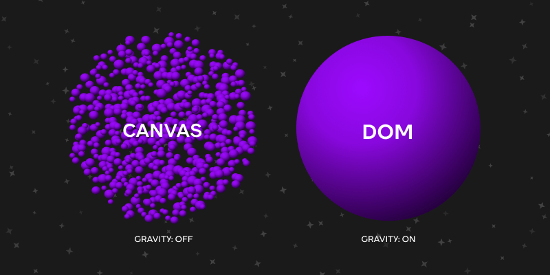
More and more, designers work on digitals products. These digital products are manifested in code eventually, built upon a node structure called the DOM (document object model), with nodes affecting other nodes, all affected by the viewport sizes and dynamic content, padding, margins, borders and layout settings. This is very different than the way the canvas works. To make the differences more salient and vivid we first need to employ a good metaphor. I like to think about this as gravity:
When you have binding relationships in a tool - it’s like on earth, you have gravity. Things are pulled downwards (or upwards in the DOM), some things push other things, when you move an object - other objects that reside above it fall and take its place. This happens in the code of websites, iOS and Android apps, and frankly any other structural environment.
On the other end free-form canvas feels like space, there’s no gravity at all, things don’t influence one another that much, if something is moved - nothing else is bothered, objects don’t gravitate neither up nor down.
So ‘canvas-like’ environments create conditions that foster more freedom and intuitive creation and ‘code-like’ environments foster structure and effective chain influence by one object on many others.
Now, there was a set of tools that used some form of DOM representation of objects, usually web builders, starting with the old but popular Dreamweaver, which Adobe acquired along with the rest of the applications initiated by Macromedia, and up to Webflow, Wix, Squarespace and all the rest in that flock. The issue is that it narrows down to websites, usually not the most interactively robust, and definitely not web or native applications. These tools were not ‘generic’ design tools like illustrator, sketch, XD and Figma, but specific for websites.
Of the generic bunch - as mentioned before, the closest we’ve ever got was Figma introducing auto layout in their already existing ‘Frames’ object. Granted, Figma still has the exact same ‘canvas’ model deep inside to render everything, but - and this was crucial - they’ve decided to simulate the DOM inside of a single frame on the canvas, to at least some extent. Auto layout - which is a limited, Figma-esque way to do regular CSS Flexbox - allowed for frames (which are basically Figma’s way to do divs) to be almost like small pockets of DOM-like behavior inside a sea of free canvas.
Third stop - the exclusion that is the rule
One peculiar thing that evolved with time (especially with the introduction of auto layout), is a situation where the product design programs are canvas based, but designers eventually use auto layout.
Now, If you’d track what happened to design files with the years - you’d see that there’s an ever increasing, non stop climb towards using components. And since components and their instances are always frames and designers would build almost all these component frames with robust auto layout structures - the exclusions from Figma’s default became the ‘mode’ in which almost all of the design eventually gets made. It’s a bit like instead of walking on earth, you are flying through space, but some synthetic generated gravity field makes you walk normally, as if they are just walking on Earth.
Pause for a moment, and think about this again:
Auto layout - which mimics Flexbox behavior, with forced direction, gaps and alignment, things pushing each other and padding actually existing and affecting things - is not the default, but is nonetheless used in almost all of the ui designs that are getting handed over to developers!
What does that surprising mismatch show us?
It shows that at least in product design - designers eventually end up preferring an environment where there is in fact gravity, where things affect each other when they grow, overflow and change. Switching auto layout for a frame is an act of volition, it’s not the default. And a couple of years later Figma added ‘position: absolute’ - a literal copy from vanilla CSS to allow for the ability to make an ‘exclusion’ from the otherwise orderly auto layout which is an ‘exclusion’ in and of itself, in the otherwise ‘absolute-position-by-default’ Figma canvas. The addition was praised by most designers as very much a life saver, because otherwise you had to create messy workarounds with more wrappers to mimic something that is solved so elegantly in CSS. Another example was when Figma introduced separate borders, something the web was practically born with (and still, they are only separated for thickness, the color and the style still have to be the same, unlike in code)
Fourth stop - wait, there’s more!
And remember - auto layout is only a sliver from what the actual DOM allows for -margins, viewport units, EM’s, REM’s, percentages, fraction units for CSS Grid, Flex shrink and grow, ‘display: relative’, calc expressions to tell the browsers what the values should be based on some math and parameters. And that’s without mentioning mechanics like media and container queries which are basically necessary to design something responsively across a span of viewport widths.
The real peril of designing with free form canvas as the basis of everything is that it’s so damn easy to just push things around statically, with specific frame width, specific text lengths (that are conveniently just long or short enough to make our designs look their best) and specific ‘idle’ state of all the components. So easy to fool ourselves that if this case looks good enough - we’ve solved it, and It works.
This convenience of just nudging something, overriding something, testing something ‘real-quick’ and generally preferring short term wins - blinded product designers from what is actually at stake here - trivially easy robustness, compositionality and natural adherence to design system rules. That’s the whole point of code - you decide the rules (which you then document) and everything abides by them. Isn’t that the Holy Grail of countless plugins, tools and Medium articles, all endlessly instructing people how to align the Canvas tool of their choice (usually Figma) and code?
It boggles my mind how far the industry went, missing the obvious culprit here - the transparent barrier we can’t seem to jump over - the canvas itself.
I’ve truly felt it myself
Some 8 years ago I tried out Webflow. It was for a portfolio website that I had to design very very quickly to enter some contest at my design academy, and I was looking for a good enough web builder to allow me as wide of a range of design freedom as possible, while still doing all the dirty work behind the scenes. It was great, I felt the most empowered as a designer that I’ve ever been, since I had almost full creative control, with no need to hope and pray that a developer will actually recreate it properly.
But not until some 4 years ago, when I was Head of Design at a high-paced startup, and I was both the brand, marketing designer and product designer, that I deeply felt it. The stark difference between the sophistication, autonomy and realism (the ui components were real, buttons, dropdowns, tabs etc..) that I was getting from Webflow and the comperatively naive frame and rectangle drawing that I was doing in Figma, using only pixels, barely having very basic auto layout, and still crossing fingers that after my very detailed handoff file the actual product will look the same (and of course almost always still being disappointed) - that it finally dawned on me.
Thinking in classes, in breakpoints of the same exact object, in inheritance, in states, in native animation, again - ruled by structure, in multiple different units at the same time (you want your section to be 100vh, but the height of the header to be 80px - no problem) opens up both the understanding of how web and native platforms operate, and the chance that whatever was designed - will have a much higher chance to be integrated or reconstructed by developers seamlessly (should they be needed in this case).
Designers might want (or even need) a canvas when they are messing around, trying things out, brainstorming, discussing, showing variations to stakeholders etc. No problem with that. But once we are designing something for real - that crucial word - real - has to lead the way. But not only that - one thing I felt quite well - some experimentation was actually much more convenient right inside Webflow because all the things that were responsive - were actually responding while I was making the decisions, which is much much quicker than manually simulating all of that, because it’s so damn hard and cumbersome to simulate robust responsiveness inside Figma.
It’s time to evolve the rules of our tools
I believe our industry will evolve beyond the canvas, to some form of Canvas + DOM hybrid type of tools, which will allow the designers to inhabit each environment when it’s the correct time in the design process. Same way that you would use Figjam and Figma for different stages in the process.
If you found this thought piece interesting, consider subscribing to the newsletter so that you don’t miss the next ones.


